21 December, 2013

being a prop stylist

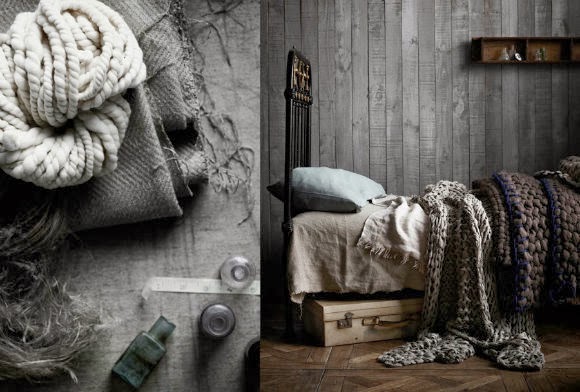
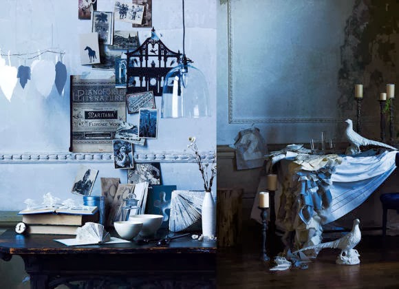
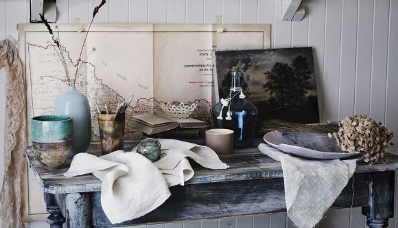
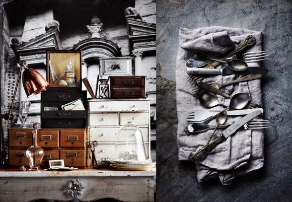
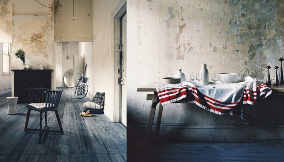
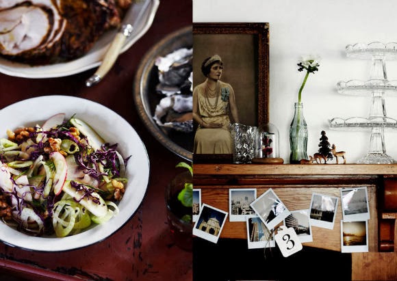
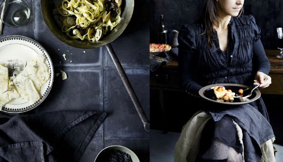
Being an engineer at heart, it is sometimes difficult to comprehend the role some functions play in the realization of a project ; any project. This may be a universal truth, and you may have faced it repeatedly (as I have) in your life so far, but more true you may find that applies in staged photography ; especially if you are an outsider to that particular market, and don’t know the modus operandi. In staged photography (the one you predominately come across as you leaf through a lifestyle magazine) there exists a function, named styling, performed by a person, named the stylist. You know this of course ; it began with your hair (hair stylist) in your beauty salon, but easily transgressed to all other areas, with the most acclaimed of all : the clothes stylist. Now there is a universal term, namely “prop stylist”, that describes what a person does, who styles objects for photographs, film, and television (and gets paid by someone else for doing so). “Food styling”, ie the function where a person is employed to make food look attractive in photographs, may be considered as a subset.

The reason why all that is difficult for me to comprehend, is actually not the lack of necessity of employing such functions in the course of a project, but quite the opposite, as a matter of fact. You might have expected that the photographer, who has the “keen eye” would take care of composition somewhat literally in staged photography, but it has proved in the course of business that (a) photographers do not have the time to actually deal with stuff staging, since they are busy with taking the damn photo at the first place, and (b) the photographer does not have that “eye” we talked about (which is more common as one might expect, when it comes to commercial/business photography). So it essentially boils down to a person that has an ability to not only be able to select and bring objects together in an aesthetically pleasing way, but also possesses a feel for how to create an emotional connection. Glen Proebstel is an New York based stylist who produces work of a truly international standard, and falls under that description.

The quality of Glen’s work comes from the understanding of fundamentals such as scale, texture, placement, colour and light, but the magic comes from the unexpected, the witty and the quirky play that underpins his signature style. He is collaborative by nature and the work he produces is often the result of working closely with photographers and clients to draw out the potential in any brief. He is a rare combination of a highly creative talent who knows how to be organized and plan so that the beauty of the result is no mere accident.

Stipla magazine

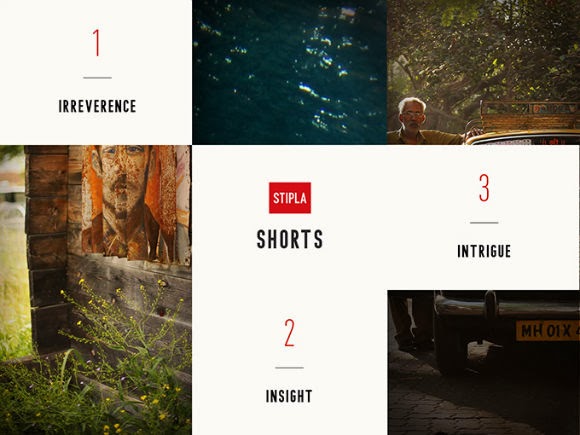
Stipla combines quality writing and photography with in-depth digital extras, for those who want to see beneath the surface of a story. From Palestinian racing car drivers to Bolivian wrestlers, Indian recyclers to British engineers, we uncover stories from around the world that reveal people and places in unexpected and captivating ways. Technology brings Stipla to life. Articles run alongside videos, panoramic photography, interview clips and animation, the playful interaction adding substance without ever distracting readers from what matters; the people in our stories. Stipla is dedicated to telling stories in the best and smartest way possible. Sometimes that's a 1500 word feature, but every so often it’s something less linear. By taking advantage of what the tablet has to offer, Stipla meets the demand for challenging stories told in a new way.

Instead of trying to configure print or website content to fit onto iPad screen, a team in London decided to take advantage of the tablet's capabilities and employ it as a unique medium for sharing stories. Stipla is a new iPad magazine that combines writing with panoramic photographs, video shorts, animations, interactive maps and more digital "extras" to bring the focus of their stories to life—and it's an immersive reading experience like no other. The name is an acronym for "story, technology, innovation, passion, life and adventure." [1]


Unlike publishing websites that make their articles accessible immediately, and anywhere, these stories will never be easily searchable or sharable on social media networks, because they live inside the iPad app. This limitation adds something valuable to the stories you read—likening it more to an actual print publication. To share an article, you would have to physically hand it over to a friend—just like the old days. Stipla Issue #1 can be downloaded at the App Store for $3, or you can purchase a recurring subscription for $6. It is compatible only with the iPad. [1]

19 December, 2013

the Wormworld Saga


The Wormworld Saga is a digital graphic novel by the German artist Daniel Lieske. Daniel started his “art career” quite early, as he says, by selling his first drawn comics on his schoolyard. In a secluded corner of a historical frame house in the old town of Warendorf, where Daniel resides with his family, he has created a studio, where he draws and paints, reads and writes, listen to music or as he says, just surf the internet for inspiration. In his own words : “I hold dear childhood memories of playing in the woods, climbing on trees and exploring gloomy places. When I was born, the first 'Starwars' movie hit theatres and I grew up with 'The Muppets' and movies like 'Indiana Jones', 'Dark Crystal', 'Legend' and 'The Goonies'. All these and much more influences show up in my artwork today. They shaped the way I look at things and built the foundation for my own imaginary worlds.”


It’s a story about a young boy who discovers a doorway into another world tucked away in his grandma’s attic—and it’s a story about a giant dragon trapped in a mountain, and about a mysterious Firelord who rises from the fires of Worm Mountain. Wormworld contains all the sorts of places Lieske would like to wander himself: “a deep forest, a long ocean shore, a high mountain range and an endless desert,” with Worm Mountain at the heart. Unlike many webcomics it wasn’t released a bit at a time. Lieske worked through it all, and then released it at the beginning of 2011 as a completed chapter, much like releasing a book. The format is also interesting ; it is one continuous scroll from top to bottom, a design choice made to avoid page turns ; which overturns the idea of the comic book (that we all are familiar with). There are still frames, of course, but it’s an interesting experience that feels like a long, seamless page from top to bottom. [1] To give you an idea :

the Orchard Keepers retreat in Australia

Taken from their website : “Under the shade of a giant Sequoia tree, nestled in a beautiful established garden surrounded by neighboring vineyards and orchards you will find our home. From our family to yours we invite you to come and enjoy Orchard Keepers.” Originally 3 separate cottages dating back to the 1890′s & 1950′s, Orchard Keepers has been lovingly restored and transformed into a beautiful four bedroom home & separate Workers Cottage providing country chic holiday accommodation for 10 people on 10 acres  in the heart of Red Hill, Victoria, Australia. A tiny paradise in the south-east of Australia. The landlords renovation and restoration works have been particularly meticulous and tasteful. Some of the decorative works here came from all over the world, like the bath towels from Japan, organic cosmetics by local producers. A Snowy wall, a huge bed, a fireplace and unique flowering gardens and ocean views. In addition, guests are invited to forage out in the two large kitchen gardens, filled with fragrant herbs, vegetables, berries, citrus and stone fruit trees. Notes are provided & updated weekly on what is in season for the guests to pick and add to their lunch or evening meal.

17 December, 2013

the gentle furniture forms of Guilherme Wentz

26 year-old Guilherme Wentz is a furniture designer based in Brazil. Many say that a designer is remembered for his chairs. Perhaps this is the great icon design, and their history, a major challenge for any designer. Eva is the beginning of a collection that celebrates the simplicity as a lifestyle. Eva chair was created with two seating options: a curved shell that stands out about the structure and can be coated fabrics such as felt and leather, and an option on the screen, which reveals the fine structure of the chair.

With an amazing background of awards-filling history, he recently released a series of wooden pieces called Gambito, consisting of a sideboard, cupboard, and bookcase that balance on minimal structures. There is something very poetic in a mass lying on a fragile support to withstand gravity. While that physical condition is a given, the physical appearance of these furnishings is customizable — giving one the ability to make this series a truly unique and personal possession. The cantilevered sideboard is characterized by its asymmetry and its push for imbalance. The concept is not new to architecture, but can be to furnitures to test the limit of functionality. Simple and daring, the Gambito Collection challenges its users to reevaluate the stronghold of structural proportions, as well as the direct translation of that into minimal designs. [1]

Backyard collection is the result of a collaborative design project between designers William Wentz, Leonardo Dalle Laste and Marina Gatelli. The project created for NOVA: Brazilian Joinery is the label's first collection was presented at the event and Home Brazil 2013.

a cabin with a wall of windows

In 2012, Nick Olson and Lilah Horwitz quit their jobs and set off to build a glass cabin (a cabin with a wall of windows) in the mountains of West Virginia. Nick is a photographer who specializes in tintypes taken with a camera he made himself. Lilah is a designer. She has made several clothing lines. “We were sitting on the exact spot where the house is now, and we started dreaming about how amazing it would be to watch sunsets from there, but how you would have to have a giant window to really get the full picture. Then that naturally turned into an idea and a sketch on a scrap of paper of a house with a whole wall of windows,” Horwitz explained. “We had really only known each other for a couple months, so at the time it seemed like a fantasy, but it was less than a year later when we started to build.” In July 2012, the couple, both local artists, left their jobs to do just that.


The couple collected their windows over a couple of weeks driving and exploring the U.S. Horwitz said their only requirements were that each window had to be different, and that they had to be cheap or free. “We collected most of the windows on a trip up to New York,” she said. Less than six months later, in December 2012, Olson and Horwitz finished the cabin, complete with elaborate window wall.

[Ref.] http://thirdcoastdaily.com/2013/11/one-creative-milwaukee-couple-finds-inspiration-in-a-house-of-glass/

16 December, 2013

the Burning man of Black Rock Desert

What started out as a small event on San Francisco's Baker Beach and then migrated to the Black Rock Desert has now morphed into a vibrant global year-round culture of like-minded individuals who seek to live their lives in a more meaningful, powerful and self-expressed way. Because of the variety of goals fostered by participatory attendees, known as "Burners," Burning Man does not have a single focus. Features of the event are subject to the participants and include community, artwork, absurdity, decommodification, and revelry. Participation is encouraged.

The Burning Man event and its affiliated communities are guided by 10 principles that are meant to evoke the cultural ethos that has emerged from the event. They were originally written by Larry Harvey in 2004 as guidelines for regional organizing, then later became a universal criterion of the general culture of the multifaceted movement; these include: radical inclusion, gifting, decommodification, radical self-reliance, radical self-expression, communal effort, civic responsibility, leaving no trace, participation, and immediacy. As said, they were crafted not as a dictate of how people should be and act, but as a reflection of the community's ethos and culture as it had organically developed since the event's inception. Read the principles, here. See photo galleries, here.

Burning Man is an annual event and a thriving year-round culture. The event takes place the week leading up to and including Labor Day (*1), in Nevada's Black Rock Desert. The Burning Man organization (Black Rock City LLC) creates the infrastructure of Black Rock City, wherein attendees (or "participants") dedicate themselves to the spirit of community, art, self-expression, and self-reliance. They depart one week later, leaving no trace. As simple as this may seem, trying to explain what Burning Man is to someone who has never been to the event is a bit like trying to explain what a particular color looks like to someone who is blind. In this section you will find the peripheral definitions of what the event is as a whole, but to truly understand this event, one must participate.

However, Burning Man isn't what it seems to be. Today it's a massive event, with cool arts whipped by regular giant dust storms in the Black Rock desert. But 30 years ago, it was an underground event put together by renegade artists in the middle of San Francisco. Law enforcement didn't like that, so with the help of the Cacophony Society, they moved it to an unforgiving wind-swept dry lakebed in the Nevada desert. It slowly changed to become the $20+ million event it now is. So what was once known mainly as a “hippy festival” has become a hot gig for international DJs covering the range of electronic dance music. (*2) Dust & Illusions is a 2009 documentary film about Burning Man and its founders that  looks at 30 years of Burning Man history back to the late 1970s. The film has been featured at several film festivals, and was shown at the San Francisco DocFest at The Roxie in San Francisco in October 2009.


Notes :
(1) Labor Day is annually held on the first Monday of September. It was originally organized to celebrate various labor associations' strengths of and contributions to the United States economy. It is largely a day of rest in modern times. Many people mark Labor Day as the end of the summer season and a last chance to make trips or hold outdoor events.
(2) What you must also know is that Burning Man is extensively patrolled and monitored by State and Federal US Officers. This article here, offers impressions, coverage and advice for all prospective Burners.

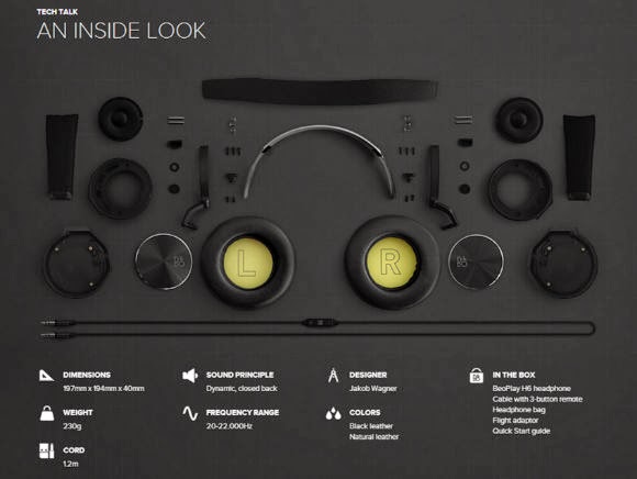
the B&O Beoplay H6 headphones

Danish electronics giant Bang & Olufsen need little introduction. Consistently producing timeless design with high quality materials, B&O have released these beautiful headphones. If you’re all new to BeoPlay H6, here’s the lowdown: BeoPlay H6 boasts a premium sound, honest and clean in its appearance and designed to give you music the way the artists intended it – without any tweaks or over-emphasized bass. The headphones are wrapped in the finest cowhide leather and lambskin, durable and exclusive materials that can withstand the wear and tear of everyday use – materials that age with beauty.

Their design is distinctive, striking the right balance of classic and modern design influences, resulting in a simple, elegant, and extremely comfortable pair of headphones. The design itself was conceived by Jakob Wagner, and with a choice of black or natural leather, it is a perfect match for the style-conscious consumer who refuses to compromise quality in sound, design or craftsmanship. The natural, stitched cow leather cover and soft lambskin ear pads, should age gracefully with use. Those comfortable headphones, also feature a detachable audio cable and ports in both speakers. This not only allows you to decide which side to insert the cable, it also allows you to share your audio with others.

BeoPlay H6 offers a truly natural and authentic sound performance with focus on a clear midrange with a balanced bass and treble performance. Includes a 40 mm custom designed driver with a neodymium magnet in a closed headphone design. BeoPlay H6 has a bass port which optimizes the bass performance and the drivers are slightly angled to get the best distance and sound direction into the ears.

Circuit Scribe : draw circuits instantly

To describe it in a concise manner, Circuit Scribe is a rollerball pen that writes with conductive silver ink. It makes creating circuits as easy as doodling. Now can you imagine what you could do with that ? You can build a circuit with nothing but a coin battery, paper clip, and LED, or build out complex circuits with multiple components. In essence it allows you to draw your circuits, cut them out, and stuff them into your inventions - instant robot guts. Conventionally used breadboards add a level of abstraction and annoyance to circuit building.  With Circuit Scribe you can draw exactly what you want, no wires or breadboard required. Check out the Kickstarter page here.

12 December, 2013

the Shanshui Experiment Complex by MAD

MAD, sometimes referred to as MAD studio or MAD architects is a studio that builds futuristic architecture based on contemporary interpretation of the eastern spirit of nature. Based in Beijing, China and Tokyo, Japan, MAD gained first international attention in 2006 when it was commissioned to design two residential towers in Mississauga, Canada. MAD partners with engineers, programmers, artists, landscape designers, energy and structural consultants from China, Germany, Italy, Japan and the United States; committed to ingenious design solutions for international projects (see also the Ordos Museum in Inner Mongolia, which was completed by MAD in 2011.

The “Shanshui Experiment Complex” is their work presented during the Biennale of Urbanism\Architecture 2013 in Shenzhen. This is an artwork in-between architecture model and landscape installation, created based on MAD’s latest project, ‘Nanjing Zendai Thumb Plaza’. The total area of this urban design project is about 600,000 sqm and it is expected to be completed in 2017.

Taken from the project description (available here) :

“The historic city Nanjing is famous for the mountain and water landscape around the city, as well as its modern prosperities. With the culture, nature and history considered, we need to rethink how to define the boundary between the nature and the urban on this piece of empty plot in the new city development area. Is it possible to combine the high-density city with the atmosphere of the nature to create an energetic urban public space for the future, so people will re-connected their emotion with the nature?

The installation approaches those issues by creating a green open space spreading on the ground level of the city, where the natural and man-made landscape cross over with each other, existing in different dimensions both indoors and outdoors. The clear boundary of the site thus becomes blurred. While walking to their urban destination, people will feel as if they are sometimes walking in the nature. Above that, a series of buildings rise in the fog with flowing lines, changing smoothly as integrity, resolving the vertical power and the height competition, and the city skyline that used to be controlled by technology and power is now back to the artistic mood of faraway-so-close that our ancients have perceived in the nature.”

MAD's design embraces the advent of a new era. It reflects the office's architectural exploration of contemporary art and the transformation of lifestyle and multimedia formats in contemporary Chinese cities. MAD's research concerning the integration of digital media into architectural design demonstrates a unique approach towards architecture. Dedicated to understanding and exploring flexibility and new possibilities inherent in simple and traditional functions, MAD enhances these by means of new organizations and logics - analyzing value, desire, culture, and political strength in contemporary China. By treating these vectors as fluid and dynamic presentations of contemporary life, structures are no longer isolated objects as defined in architectural modernity; they become natural and coherent components of human life and the urban environment. [1]

welcome dear reader.

blank

What you are browsing through is the initial form of a gazette, realised at this stage by a collection of posts brought together, from various fields & selected topics, aiming towards your entertainment and information. Some are own generated, others are processed re-ups from the blogosphere. Please feel free to browse, read, and distribute the content here.

blank

If you find what you read here as interesting, entertaining or thought-provocative, please tell it to your friends. New readers are always welcome. If you have copyright claims, please let us know, and we will amend accordingly.

blank

Images presented herein, are the property of their originators, unless stated otherwise. The METRONOME gazette wishes to declare that to the best of its knowledge, all photos and information presented in this website are true and valid, however it carries no responsibility as to the accuracy of the depictions, or wording of the posts, that are not of its own origination.

blank

Please do not hesitate to contact us with any inquiry or question you may have. See the Contact details section.
  

blank

about

blank

contact

blank

editorial

blank

theNEWSroom

blank

theMAGAZINErack

blank

DIY projects

blank

GAMESZONE

blank

GoingOUT

blank

Food4Thought

blank

PROJECTS

blank

blank

blank