28 November, 2013

media manipulation strategies

The ten points offered below, I could not find a direct attribution to Noam Chomsky (the ten media manipulation strategies are attributed to him, in accordance to the text widely in circulation over the Internet), although the rationale and argumentative thesis seem characteristic of his style. In addition, the direct references of the original text to the book “Silent Weapons for Quiet Wars” point to a rather controversial publication (see Ref. list for more info). As so, I cannot vouch for their authenticity or whether they are a product of Chomsky, since I could not find direct references to his work (or quotes from his work / speeches / lectures). However, I reproduce them here, since they carry a certain truth, analogies of which we may notice in our everyday lives, and could spark fertile debates. 

The reproduced text begins here.

Renowned critic and always MIT linguist Noam Chomsky, one of the classic voices of intellectual dissent in the last decade, has compiled a list of the ten most common and effective strategies resorted to by the agendas “hidden” to establish a manipulation of the population through the media. Historically the media have proven highly efficient to mold public opinion. Thanks to the media paraphernalia and propaganda, have been created ordestroyed social movements, justified wars, tempered financial crisis, spurredon some other ideological currents, and even given the phenomenon of media as producers of reality within the collective psyche. But how to detect the most common strategies for understanding thesepsychosocial tools which, surely, we participate? Fortunately Chomsky has been given the task of synthesizing and expose these practices, some more obvious and more sophisticated, but apparently all equally effective and, from a certain point of view, demeaning. Encourage stupidity, promote a sense of guilt, promote distraction, or construct artificial problems and then magically,solve them, are just some of these tactics.

1. The strategy of distraction
The primary element of social control is the strategy of distraction which is to divert public attention from important issues and changes determined by the political and economic elites, by the technique of flood or flooding continuous distractions and insignificant information. Distraction strategy is also essential to prevent the public interest in the essential knowledge in the area of the science, economics, psychology, neurobiology and cybernetics. “Maintaining public attention diverted away from the real social problems, captivated by matters of no real importance. Keep the public busy, busy, busy, no time to think, back to farm and other animals”.

2. Create problems, then offer solutions
This method is also called “problem -reaction- solution.” It creates a problem, a “situation” referred to cause some reaction in the audience, so this is the principal of the steps that you want to accept. For example: let it unfold and intensify urban violence, or arrange for bloody attacks in order that the public is the applicant’s security laws and policies to the detriment of freedom. Or create an economic crisis to accept as a necessary evil retreat of social rights and the dismantling of public services.

3. The gradual strategy
Acceptance to an unacceptable degree, just apply it gradually, dropper, for consecutive years. That is how they radically new socioeconomic conditions (neoliberalism) were imposed during the 1980s and 1990s : the minimal state, privatization, precariousness, flexibility, massive unemployment, wages, do not guarantee a decent income, ...so many changes that have brought about a revolution if they had been applied once.

4. The strategy of deferring
Another way to accept an unpopular decision is to present it as “painful and necessary”, gaining public acceptance, at the time for future application. It is easier to accept that a future sacrifice of immediate slaughter. First, because the effort is not used immediately. Then, because the public, masses, is always the tendency to expect naively that “everything will be better tomorrow” and that the sacrifice required may be avoided. This gives the public more time to get used to the idea of change and accept it with resignation when the time comes.

5. Go to the public as a little child
Most of the advertising to the general public uses speech, argument, people and particularly children’s intonation, often close to the weakness, as if the viewer were a little child or a mentally deficient. The harder one tries to deceive the viewer look, the more it tends to adopt a tone infantilizing. Why? “If one goes to a person as if she had the age of 12 years or less, then, because of suggestion, she tends with a certain probability that a response or reaction also devoid of a critical sense as a person 12 years or younger.”

6. Use the emotional side more than the reflection
Making use of the emotional aspect is a classic technique for causing a short circuit on rational analysis, and finally to the critical sense of the individual. Furthermore, the use of emotional register to open the door to the unconscious for implantation or grafting ideas , desires, fears and anxieties , compulsions, or induce behaviors …

7. Keep the public in ignorance and mediocrity
Making the public incapable of understanding the technologies and methods used to control and enslavement. “The quality of education given to the lower social classes must be the poor and mediocre as possible so that the gap of ignorance it plans among the lower classes and upper classes is and remains impossible to attain for the lower classes.”

8. To encourage the public to be complacent with mediocrity
Promote the public to believe that the fact is fashionable to be stupid, vulgar and uneducated…

9. Self-blame Strengthen
To let individual blame for their misfortune, because of the failure of their intelligence, their abilities, or their efforts. So, instead of rebelling against the economic system, the individual auto-devaluate and guilt himself, which creates a depression, one of whose effects is to inhibit its action. And, without action, there is no revolution!

10. Getting to know the individuals better than they know themselves
Over the past 50 years, advances of accelerated science has generated a growing gap between public knowledge and those owned and operated by dominant elites. Thanks to biology, neurobiology and applied psychology, the “system” has enjoyed a sophisticated understanding of human beings, both physically and psychologically. The system has gotten better acquainted with the common man more than he knows himself. This means that, in most cases, the system exerts greater control and great power over individuals, greater than that of individuals about themselves.

The reproduced text ends here.

Avram Noam Chomsky (born December 7, 1928) is an American linguist, philosopher, cognitive scientist, logician, political commentator and activist. Sometimes described as the "father of modern linguistics", Chomsky is also a major figure in analytic philosophy. He has spent most of his career at the Massachusetts Institute of Technology (MIT), where he is currently Professor Emeritus, and has authored over 100 books. He has been described as a prominent cultural figure, and was voted the "world's top public intellectual" in a 2005 poll. [1]

Propaganda is to a democracy what the bludgeon is to a totalitarian state.
from the book “Media Control”, by Noam Chomsky, Seven Stories Press, 2002


The Internet is full of references quoting the “ten manipulation strategies” presented above.

Silent Weapons for Quiet Wars

the furniture forms of Florian Saul

German designer Florian Saul is both a trained carpenter and designer, so his passions have merged to create the fantastic portfolio of furniture that you see on his website. Originally Florian decided to investigate the traditional technique of bent wood, which is actually quite rare to see for an independent maker as it can be a tedious process with a lot of experimentation needed. He ended up constructing his own steam chamber in his workshop, feeding hot moist air through his mother’s canning pot, until he could produce even strong oak slats bent to his will and acheive the desired radius. To finish he had created the award-winning solid oak table named Vita and the graceful Servus coat rack, and with this mentality we’re sure to see plenty more interesting design methods in the future. [1]

house in Aldeia do Juso

Lisbon architects ARX Portugal and Stefano Riva have completed a top-heavy house in the village of Aldeia de Juso with a concrete upper storey settled over the glazed walls below. In the concept for this small house, the tiniest area of flat land and the house’s, as well as the high density of the new houses yet to be built in the surroundings, forcibly draw us to some sort of “obsession” about the possibilities of dilating space. Underlying this question, the importance of “expanding” the outdoor space becomes a particular central aspect, since it is also a building integrated in a semi-rural area, where people go looking for the experience of inhabiting garden or open yard spaces.

The building has been thus structured in three floors, spatially related in profile, each level having specific and different characteristics. In Level -1, the areas are laid out (as the regulations so demand) under the contour of the ground level. In this floor there are also included work and service areas. On the ground level, the limits for the “precincts”, appears widened and defined by the walls around the lot. The inner space is freely configured. Consistent with the strategy of maximizing the presence of the gardened outdoor space, the garage is then left aside to an “inserted” area to the south of the kitchen. All the social spaces of the building are located on this floor. On the upper floor resides what is the most significant expression of this project. A kind of enclosure of opaque lines encompassing the bedrooms and their respective yards was shaped, thus expanding the enjoyable areas and protecting their necessary intimacy. On the roof level, an accessible terrace finally liberates the eye over a 360Âş view of the surrounding houses, the sea or the beautiful mountains of Sintra.

24 November, 2013

the Gymkhana videos of driftmeister Ken Block

Gymkhana events are time and/or speed events in an automobile. The name is loaned from the equestrian discipline of gymkhana. Similar to equestrian, gymkhana courses are often very complex and memorizing the course is a significant part of achieving a fast time. These can feature obstacles such as cones, tires, and barrels. The driver must maneuver through a predetermined "track" performing many different driving techniques. What separates gymkhana from traditional autocross events is that the gymkhana requires drivers to perform reversals, 180 degree spins, 360 degree spins, parking boxes, figure 8s, and other advanced skills. Drifting is also encouraged where helpful or necessary. Essentially, a gymkhana is any event featuring a starting point, a finish line and some sort of "obstacle" to get through, around, or by, all within a certain time limit. [1]

Ken Block (born 1967, in Long Beach, California) is a professional rally driver with the Monster World Rally Team. Block has also competed in many action sports events including skateboarding, snowboarding, and motocross. The original Ken Block’s Gymkhana project also known as GK1 has now become a cultural phenomenon. The video saw well over 20M Views, in countries all over the world. The YouTube sensation was found to be one of the most successful automotive films ever, period. In 2009 the sequel GK2 was born, with Block ready to hoon more that he had ever hooned before.


Now officially counting Gymkhana video No. 6, it's Ken Block, in a 650bhp Ford Fiesta ST with a sticker on the rear that reads "kill all tires". To be honest, it's not as cool as Gymkhana 5 (shot on the streets of San Francisco), nor as glamorous as Gymkhana 4 (a Hollywood-themed drift-off) but feels more in the spirit of the very first Gymkhana he released many moons ago; a display of his sheer technical skill in smoking the rears and performing eye-wateringly huge donuts. He even maneuvers his way around a moving wrecking ball; a fitting end to, essentially, Block's modus operandi for his car's tyres. [2]

shapewear, padded or enhancing underwear, the Wonder(bra) options for men

A foundation garment (also known as shapewear or shaping underwear) is an undergarment designed to temporarily alter the wearer's body shape, to achieve a more fashionable figure. The function of a foundation garment is not to enhance a bodily feature (as would, for example, a padded bra) but to smooth or control the display of one. [1] Men's padded underwear on the other hand, typically serves one of two purposes : either it protects your anatomy from trauma or it makes your anatomy look bigger. In some cases it can serve both purposes. Whichever is the case, it only makes sense to invest in quality padded men's underwear because either your manhood or your reputation is a stake.

Women have worn foundation garments, such as corsets and brassieres, for a very long time. Some have been essential to the fashion trends of the time. Others have been born out of the need for women to feel more secure. The same we may reasonably say that applies to men also. Men have been in the past, but increasingly do so in the past few decades, wear undergarments that help them “restrict”, and in other words conceal non-aestheticaly pleasing body-shape features. This is where shapewear comes in use, and thus displays an increasing raise in popularity and sales, especially after the 90s.

Depending on what sports you are into, men's padded underwear might be required to protect your parts. Cycling can do a number on them, particularly if you are riding long distances or over bumpy terrain. Martial arts are another type of sport where protective underwear is absolutely mandatory. Kicks and punches landed by your opponent in an unprotected groin could have you singing soprano for days. [2] Again if you are looking for comfort and cushioning, due to age and joint stiffness, padded underwear offer the level of sport necessary. If on the other hand, you are looking to augment either your package or your rump, men's padded underwear is a simple, inexpensive and temporary option that is far more practical than surgery.

There are numerous diets and routines that claim to help men lose fat and build muscle in implausible lengths of time. The truth is that it takes hard work and determination to obtain a great physique. For those still looking for a quick fix without the effort shapewear will give that competitive edge. At first glance, shapewear looks like a regular shirt. Upon closer inspection, the material is lined with padding to enhance the key areas involved in muscle building, the pectorals, shoulders, biceps and triceps. Designed to be worn underneath regular clothing, the shirts are made of material that allows the skin to breathe and ensure wearers don’t get too hot. [3]

Adapted from a blog for women (since women know better, they have been doing it, like … for ages) on advice of “How to Choose the Right Shapewear for you” [4] :

1. Purchase the right size.  Buying a smaller size does not make you thinner, it actually will create more problems by pushing things into places they should never be.
2. Focus on the part of the body you want to shape.
3. Define the purpose. Ie. You want it for sports, or a special occasion where it will be seen.
4. Make sure to choose the level of support you need.
5. Try it on! Never, Never , Never buy shapewear WITHOUT trying it on! 
6. Put it on correctly.
7. We sweat, so  if you are in a high temp region look for light weight summer style shapers.

When choosing padded underwear for men there are different styles and comfort levels just as there are for women. There is the brief that comes in normal or low-rise, a pair that can lift and push up what is already there, the padded jock, which is very popular, as well as many other types. There is padded underwear for men that are just like that for women.  They contain pockets that one can insert pads into. One can choose between silicone and foam pads much of the times depending on what is more comfortable to the individual. There are pairs of padded underwear that do not have pads but actually provide a lift and separate feature. This allows the man to work with what he already has instead of relying on pads. Just like padded panties for women, for men there is also waist slimming underwear. Whichever is the case a man still may need the extra feature of a tummy tuck, and luckily there is also padded underwear for men that provide that slimming effect. [5]

Some companies out there :

the Safeplug for internet anonymity

You wouldn’t post your home address just anywhere online. So why give it out to every website you visit ? When you browse the Internet, every site you visit knows your IP address (a unique number that identifies your computer on the Internet) which can easily reveal your physical location and home address. This information could be accessed, hacked or even sold, exposing your identity and location to unknown parties and putting your family at risk. Pogoplug (a cloud storage service provider) has launched a new privacy adapter, Safeplug, which the company says can add internet anonymity within seconds. With Safeplug, you can effectively stop websites from knowing or logging who you are and where you live. Safeplug sets up in 60 seconds and allows you to use your existing web browser, and even your phone, to browse the Internet with complete anonymity and peace of mind.

Safeplug does not require any additional software to be installed on your computer, and is compatible with any modern Internet browser that you already use. Safeplug uses the Tor network to secure your Internet connection. Tor works by routing your Internet traffic through a series of random destinations, much like driving a twisty, complicated route to throw off someone who is following you, making it impossible for websites and organizations to identify the source or destination of Internet traffic. While using Safeplug however, it is likely that you will notice reductions in your overall Internet speed and page-loading times. This is because your Internet traffic is being bounced to computers across the globe to make your Internet browsing impossible to trace. This will reduce in effect as Tor gains popularity over time. Also be advised, that Tor has been known as the home for many let’s say “not-so-legal” activities. Furthermore it is recommend that you clear your cookies between anonymous browsing sessions, even when using Safeplug.

22 November, 2013

the Lampociclo e-bikes

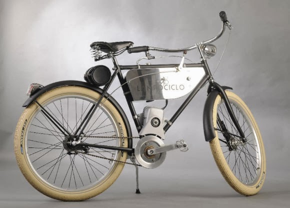
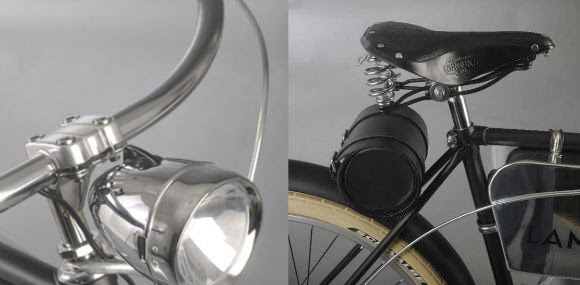
When motorbikes were little more than bicycles it was fun to drive them, people making these motorized bicycles had greasy hands and no two of these vehicles were alike. They were built with passion and for this reason they were and are valued. Lampociclo is an exclusive E-bike inspired by 1920 motorbikes, each bike is hand built on customer order. Lampociclo believes in craft excellence and customized product. In their own words : “Dealing directly with people building with their own hands can be relevant in a word populated by mass produced goods at any price level.” The entire bike and E-bike range by Lampociclo, made in Italy, can be customized by size, color, or graphics. Furthermore they can furnish unique pieces based on modular components.

Each bike comes with a standard 250-watt brushless motor (with larger 350-watt and 500-watt options available) that can achieve speeds up to 15.5 mph with enough battery power for 43 miles of range. More powerful motors can push the bike up to speeds of 28 mph. The lithium iron phosphate battery takes about six hours to charge.

Simply Gum : the 100% natural chewing gum

Regular chewing gum is packed with artificial - and potentially toxic - substances, including aspartame, BHT, and the same components of rubber tires, plastic bottles, and white glue. Consumers are kept in the dark about what they are chewing because the FDA allows up to 80 synthetic ingredients to be hidden in the catch-all term “gum base.” According to the producers : “We couldn’t find a single gum brand in the US that shares their entire ingredient list with consumers. We also couldn't find a single brand that was truly 100% natural”.

Conceived by a team of entrepreneurs including Caron Proschan (a natural product devotee) Simply Gum is made (in New York) from just six ingredients—all of which are listed on the package. Neither artificial flavoring, preservatives, aspartame nor other synthetics are added, and this 100% natural gum is made of chicle (which is an ingredient obtained from the sap of the tropical sapodilla fruit tree), organic dried cane juice, organic vegetable glycerin, organic rice flour, organic sunflower lecithin and all-natural cinnamon flavor. For now, cinnamon is the only available flavor, but there are plans to introduce mint in the near future. The gum is soft and pleasant to chew, and the most striking difference is the flavor—it's significantly different from the gums we are accustomed to. It's less saccharine and overall more subtle, though the flavor still lasts. [1]

Now aside from aggressive marketing, there are other all-natural chewing gums out there. One example is Glee Gum. Made again with chicle, the natural tree sap harvested sustainably from the rainforests of Central America. Once all chewing gum was made with chicle, but today most gum is made entirely from synthetic stuff. Glee Gum uses chicle because it is an eco-friendly way to help conserve the rainforest, giving trees more value standing than chopped down for lumber. Plus, Glee comes packaged in biodegradable, recycled cardboard and resealable, recyclable pouches. Classic Glee is sweetened with Fair Trade cane sugar and brown rice syrup. Sugar-Free Glee is sweetened with 100% xylitol from American birch and beech trees for added dental benefits. Furthermore, Glee not only offers chicle-based tangerine, cinnamon and peppermint gum, they also offer a do-it-yourself kit. Part science lesson and part eco-chic custom experience, these kits also reinforce the virtuous values of sustainability and natural over artificial.

There is also PepperSmith’s, that again uses no artificial flavours, colours or preservatives, no aspartame and no petro-chemical bases. The very zesty Sicilian lemon & fine English peppermint gum is one of my favorites. Made with the finest Sicilian lemons from the Femminello and Monachello varieties that are picked from the superior winter crop. They also have a touch of our distinctive fine English peppermint, farmed in Hampshire, giving them a nice cooling freshness. Check out their ingredients info pages, available here.

Further reading :

21 November, 2013

desks selection for single workspaces

Doppeldecker Table is a minimal design created by Netherlands-based designers Bernotat&Co. The surface combines the functionality of work and leisure with its signature moveable lid that exposes a desk when flipped down. When exposed, the desk has various drawers for random items and even an elastic band to hold down documents or electronic peripherals. The designer gives the scenario of an individual working at the dining table, and then having to clean up in order to make way for the plate settings. With this design, the individual can now store everything within the desk, and fold the desk back up to provide a clean and empty surface for eating. More info and images, available here.

Laura Desk is a minimal design created by USA-based designer Phloem Studio. Phloem Studio, located in Portland, Oregon, designs and builds custom furniture and cabinets for residential and commercial spaces. There are three open cubbies at the back end of the desktop, hiding two cord ports back in the shadow. The front edge of the desktop contains two angled drawers that pull out to reveal themselves as simple storage solutions for small items like pens, paperclips, smart phones, and notebooks. The drawers are actually wedge shaped to follow the profile line of the sides of the desk. They have playful shapes routed in the front to help with organization. It stands 34 inches tall to the top of the cubbies in the back, the writing surface is 30 inches off the floor, it’s 42 inches wide and 30 inches. More info and images, available here.

Ernest is a minimalist design created by Spain-based designer Borja GarcĂ­a. The desk was developed for the company Punt. The wiring solution is integrated within the workstation allowing for a traditional and romantic piece to respond to the needs of the new century. There is also storage space underneath the surface on the right side of the desk. More info and images, available here.

7 Bis Repetita is a minimalist design created by France-based designer Cyril de Moulins. The secretary desk features a symmetrical design with two plates placed on two trestles. The nestled storage areas are created by the secondary surface. The desk consists of a steel folded 4mm and two trays in light beech. These products are manufactured in France in the Pays de Loire and Nord Pas de Calais. More info and images, available here.

Desk One is a minimalist design created by England-based furniture brand Another Country. For the home study, the work place or a quiet corner – the popular Desk One can be as professional a piece of furniture as you want it to be. Reminiscent of an archetypal school desk, Desk One features a drawer, an indentation to hold pens and pencils and comes with a cable tidy to accommodate more contemporary desktop objects. Desk One is compact, sturdy and ready to work as hard as you do. The black lacquered version is made of solid chestnut and features their (peg-less) screw leg system. More info and images, available here.

Homestation is a minimalist design created by Denmark-based designer Henrik Soerig. Optimised to accommodate digital gadgets (cables hide in the in-built covered channel), ‘Homestation’ is an excellent working base. It’s also a wonderful piece of woodcraft, with an immaculately detailed frame and angled drawer fronts. Available in oak or walnut. More info and images, available here.

My Writing Desk is a minimal desk designed by Lithuania based designers etc. etc.. This is a writing desk designed to reduce the difficulties of working in a mess. It has its storage space organised around the table top where all the things are always in sight and easily accessible. The desktop can be used right up to the edges without worrying that things might fall down, and any unnecessary objects can simply be pushed to the storage sides. The high edges of the desk isolates it in the room and creates a positive microclimate where things “feel good” in relationship with the user.The wings are divided for simple construction leaving a path for the wires. There are two drawers for a laptop and writing equipment. The legs of the table can be twisted off for easier transportation. More info and images, available here.

Graft Desk is a minimal design created by Scotland-based designer Derek Welsh. The Graft desksĘĽ understated appearance defies itĘĽs practical potential for use in a variety of environments. The effortless framework, with two concealed drawers, is balanced perfectly alongside the warmth and practicality of the uncluttered desk top linoleum surface. The desk is constructed of unfinished solid oak timber, oak veneer drawer bases and mid-grey desk top linoleum. More info and images, available here.

welcome dear reader.

blank

What you are browsing through is the initial form of a gazette, realised at this stage by a collection of posts brought together, from various fields & selected topics, aiming towards your entertainment and information. Some are own generated, others are processed re-ups from the blogosphere. Please feel free to browse, read, and distribute the content here.

blank

If you find what you read here as interesting, entertaining or thought-provocative, please tell it to your friends. New readers are always welcome. If you have copyright claims, please let us know, and we will amend accordingly.

blank

Images presented herein, are the property of their originators, unless stated otherwise. The METRONOME gazette wishes to declare that to the best of its knowledge, all photos and information presented in this website are true and valid, however it carries no responsibility as to the accuracy of the depictions, or wording of the posts, that are not of its own origination.

blank

Please do not hesitate to contact us with any inquiry or question you may have. See the Contact details section.
  

blank

about

blank

contact

blank

editorial

blank

theNEWSroom

blank

theMAGAZINErack

blank

DIY projects

blank

GAMESZONE

blank

GoingOUT

blank

Food4Thought

blank

PROJECTS

blank

blank

blank