26 June, 2013

terminal velocity : the Isle of Man TT race

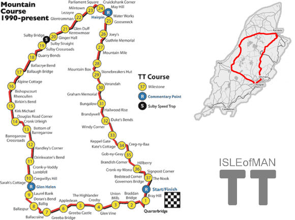
Frank Hulbert and Jack Marshall cannot have realised the significance of the moment as they pointed their single-cylinder motorcycles up the dusty track towards Ballacraine at 10 am on the cold, cloudy morning of 28 May 1907. The Isle of Man Tourist Trophy races were born as the two Triumphs spluttered into life to start their 158-mile journey around the 15-mile 1430-yard St John's Course, plotted on the picturesque island.

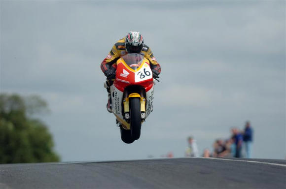
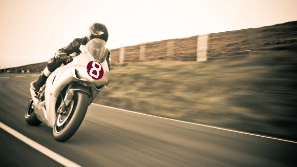
The Isle of Man Tourist Trophy is the greatest motorcycle road race in the world, the ultimate challenge for rider and machine. It has always called for a commitment far beyond any other racing event, and many have made the ultimate sacrifice in their quest for victory. A story about freedom of choice, the strength of human spirit and the will to win. It's also an examination of what motivates those rare few, this elite band of brothers who risk everything to win.


The  Isle of Man TT Races stand as the last of the great motor-sporting tests in the world today. Remaining largely untouched since 1911, the 37¾ miles of public roads have played host to some of the greatest motorcycle races and riders of all time. From Mike Hailwood’s epic duels with Giacomo Agostini and Phil Read, to the record-breaking rides by Geoff Duke, Mick Grant and Joey Dunlop, the TT simply reverberates with special memories.

The Isle of Man TT, is widely regarded as one of the world’s premier motor-racing events as well as one of the most dangerous. Held on private roads that have been closed off to other traffic by dictate of the government (the Isle of Man takes its motorcycle race very seriously), racers compete in time trials to see who can navigate the courses fastest. The Isle of Man TT involves insanely high speeds in very tight and challenging quarters. These are hardly courses meant for motorcycle racing; they’re more intended for your regular automobile, and as such, the level of skill involved on behalf of the riders is immense.


As well as being the home of road racing, the Isle of Man has much to offer visitors at any time of the year. Despite being fondly referred to as the ‘Rock’ by residents, the Isle of Man is actually approximately the same size as Ibiza and Singapore, though with a lot fewer people. The Isle of Man is home to a wide range of wildlife and this can be enjoyed on land or at sea if you fancy taking a boat tour to check out the basking sharks which frequent the waters around the Island. For more information about attractions and events in the Isle of Man go to visitisleofman.com.

21 June, 2013

the Hansen Family handmade furniture

The Hansen Family is a label with a strong handcrafted character, founded by designer Gesa Hansen who grew up in a scandinavian family of carpenters, designers and architects. After graduating at the Bauhaus-University and stopping at a few design studios such as Jean Nouvel and H5 in Paris, and the NDC in Tokyo, she decided to create her own label, combining new design and family savoir-faire in the family atelier. “Homegrown” in the business comes from the natural resources of oaks that we harvest in local forests, in this way allowing each piece to be handcrafted and unique. The first collection won two times the international Red Dot award and the International Good Design Award of the Chicago Athenaeum.

The Hansen Family furniture are made in a small atelier using ecologically grown wood, which are mainly coming from massive oak and sustainable forests.  Located at the heart of the Sauerland region in Germany, the main atelier is surrounded by these forests and therefore nestled in the woods. Each piece of wood is precociously selected by hand, which allows the designer to say that not one piece is alike to the other. The design features the wood itself, giving birth to handcrafted and unique objects.

Combining minimalism with sustainably grown wood, the Sound Sideboard and Radio Rack blend into the surrounding decor while providing you with the audio requirements you need to rock out. The Remix Sound Sideboard was created for the brand Tivoli Audio. It provides the perfect space for Tivoli’s Radio Combo. While the radio combo is visible, you can hide less beautiful devices in the lower cases.

re.vu : your online resume page

Modern technology makes it possible to design a dynamic, interactive, and visual resume that is significantly more effective at representing the whole person than a common resume alone. This is the core concept of re.vu (pronounced "review") - a radical redesign of the traditional resume. Re.vu makes it simple and fast for anyone to create an original and compelling visual resume. The rich combination of widgets, themes, and personalized settings makes each re.vu unique and memorable. It’s not just a visual resume, it’s a better visual resume available to everyone, free of charge. And yes, there is a place to link to your traditional resume too.

The key to using Re.vu is to have an account with LinkedIn, the professional social network. When you set up a Re.vu account, you're asked to utilize its LinkedIn importer, so it can build your résumé timeline based on the data stored at social network. The timeline is the core of your résumé landing page at re.vu/username. Page creation is performed with a floating toolbar that makes it easy to change the background, theme, or arrange elements on the page. Unfortunately you are not offered many choices, since Re.vu does not want anyone going wild on cv design. Re.vu wants to keep things totally professional. For that reason alone, a Re.vu page is the best place to send prospective employers than any other landing page. [1]

At Re.vu the page is about the data, not the background. The timeline of your work and education is only imported once. After that, you have to keep it updated separately from LinkedIn. Once the data is imported, visit your profile and make edits anyway, because the fun stuff for the page isn't imported, you have to add it. That includes logos or images for each job you've had in the past, which pop-up when a cursor is passed over that section of the timeline. The Infographics tab will let you insert vital stats (put in numbers for anything, like businesses you've started, articles you've written, etc.), as well as graphs showing your job duties, favorite pastimes, interests, and languages. You can also upload portfolios of your work to show off. These are the extras that make for a more interesting online résumé and, hopefully, will lead to a great job interview. [1]

20 June, 2013

Hammer & Tong 412

Hammer & Tong 412 Eating House & Coffee Bar is located just off Brunswick St. Fitzroy, one of Melbourne’s most renowned shopping strips. A partnership between head chef Simon Ward and manager Dennis Ferreira, Hammer & Tong celebrates casual dining and simple, fresh ingredients. An open bar and kitchen is the heart of the light filled space. Hammer & Tong have reworked the stylish interiors created for former premises The Brix with their own take on vintage-industrial chic.

Owners Simon Ward and Dennis Ferreira, who were previously comrades at fine dining spot Vue du Monde, have taken a more relaxed approach to their own venue. They talk of their food as being “fresh, simple and generous”, a description which could easily be applied to the interior design of H&T. Hanging vines and a wall of wooden slats bring the place to life, adding organic colour to the mineral canvas of marble and tile. On the menu you’ll find similarly hearty dishes – rustic with a modern twist – which can be enjoyed in three distinct rooms. The main dining hall, corridor bar and sunroom offer patrons a choice of environments, but all benefit from their fair share of light and au naturel décor. It all works very well together. [1]

Hammer & Tong’s dynamic interiors consist of three dining areas; the main dining hall and coffee bar, the corridor bar and the sunroom. Each area is unique in its design and ambience, lending to a unique drinking and dining experience. Servings are generous and the food is classic with a twist. Breakfast could be buttermilk pancakes sprinkled with popping candy; lunch - truffled duck egg served on Parmesan toast or a crisp salmon salad. Read some reviews here and here.

Bicycled : a bike made out of cars

"Because we are concerned about where the world is going now, at Lola Madrid we believe it's always better to do than to say. So before talking about the perfect bike, we decided to create it." These are the words of the people behind Bicycled, a Madrid based creative and advertising agency, named Lola Madrid.

Some of the upcycled uses are obvious, as car seats become bike seats and handles become handle bars, but other parts are even more inspiring. Lola Madrid strips the car engines of their transmission belts, cutting them down into strips and making them into the bicycle’s chain, which is sure to not get stuck in its gears. The blinking turn signals from each automobile is upcycled into the bike’s safety reflective lights, while other upholstery is woven around the handlebars to make them comfortable for riders. [1]

Bicycled is not only a new type of bike, it is also a return to the roots of biking. It's a handmade bike created specially by bicycle shop owners. Those fantastic creatures that are about to become extinct. Because every Bicycled is made out of real car parts, there won't be two of a kind. That's the key to a product designed to use as much car waste as it can. Although the line has yet to complete, Lola Madrid has a great video which shows just how they transform each car part into a new element of the bicycles. Salvaged from junkyards, the bikes can be made entirely from one car, or several. Using this scrap metal, each frame is entirely unique, giving riders the pride of having the only bicycle like it.


28posti restaurant in Milano

The 28posti restaurant room is cosy and intimate, and it only seats 28 people (thus the name). It is located in a quiet street in the core of Navigli's neighbourhood, precisely where in the past was located the historical club "Karaoke Canta Milano". The architectural project is designed according to the original spatial characteristics and it is supplied with furniture entirely produced with waste materials. It was designed by Italian architect Francesco Faccin and built by inmates from a local prison. The convicts of the penitentiary who have been able to benefit from the Art.21 could participate to the construction process. After this important experience, the restaurant will continue to be devoted with diligence to the reinstatement of disadvantaged groups.

The kitchen is the centre of the project: the guests can have access to it through a quick passage at the entrance and though a loophole in the main room which reveals the preparation of foods. The cuisine is oriented toward ethical values, attentive to the quality of food, the respect for the environment and the fairness of the production processes. Read some more info here.

Embrace+ the wrist notifier

The EMBRACE+ is a smart piece of wearable technology that alerts you to changes in your environment. Through a combination of visual and tactile cues, the EMBRACE+ gives you the information you want to know - while your Smartphone stays in your pocket or purse. It brings a smart and subtle change to our daily lifestyle as it keeps us connected to our phone no matter what we are doing, when we are doing it, and where we are at. Through a simple set-up of some basic parameters on the Smartphone you already have, the EMBRACE+ will show you what you want, and when you want to know it. What it shows, how it displays your information, and how frequently you see the information is completely up to you.

It is primarily made from silicone that allows for a subtle diffusion of light as that is emitted from the bracelet's light source. It pairs with your phone via Bluetooth, and has the ability to operate for 10 or so days, on a full charge. Available in two sizes (one for men, the other for women), it is planned to be open source, to allow for extensive integration to existing or future applications. The funding campaign on Kickstarter was ended on the 9th of June, but check on their page for latest news and availability.

13 June, 2013

littleBits : creativity that works

littleBits are color-coded “bits” that snap together magnetically to make it easy for children and adults to build simple circuits and inventive projects in seconds ; from flickering lanterns to piggy banks to light-sensitive cars. Founded by MIT graduate and TED Senior Fellow Ayah Bdeir, littleBits wants to make learning about electronics more fun and accessible to spark the world’s next generation of inventors. The growing community of Bitsters ranges from designers, artists and museums to parents, schools and after-school programs.

littleBits is an opensource library of electronic modules that snap together with tiny magnets for prototyping, learning, and fun. littleBits consists of tiny circuit-boards with specific functions engineered to snap together with magnets. No soldering, no wiring, no programming, just snap together for prototyping, learning and fun. Each bit has a specific function (light, sound, sensors, buttons, thresholds, pulse, motors, etc), and modules snap to make larger circuits. Just as lego allows you to create complex structures with very little engineering knowledge, littleBits are small, simple, intuitive, blocks that make creating with sophisticated electronics a matter of snapping small magnets together.


When you order a kit online, the shimmering purple box that arrives will look more like a box of chocolates than circuitry. That’s part of the fun: dissolving the aura of inaccessibility that surrounds engineering. Inside, neon-colored Bits range from USB power sources to solar panels to sound sensors. The sets are designed to get people making right away. Anything. A light-up Halloween costume, say, or a remote control car, or a blender. In place of step-by-step guides or goals, the company has an online community of LittleBits owners who upload videos of their creations and troubleshoot what they’re working on. The bits themselves can be bought in sets, but you can also buy individual bits to suit your interests, and suggest new bits for the company’s ever-growing offerings. Since it’s an open-source project, you could also just download the circuit diagrams from GitHub and make the bits yourself. [1]

08 June, 2013

Optical glass house in Hiroshima

The high rises of downtown Hiroshima conceal an unexpected architectural gem that offers an oasis of calm amidst the big city bustle. Architecture studio Hiroshi Nakamura & NAP designed the Optical Glass House to shelter its residents from the acoustic and visual debris of the city streets. The dream-like space of shimmering reflections and flashing tree leaves is contained within a 13-ton façade made from 6,000 glass bricks.

The first floor of the Optical Glass House is occupied by a garden and a glass façade positioned towards the street that maximizes natural lighting. The living areas are located at the far end of the house, and they open onto the courtyard. A sputter-coated lightweight metal curtain between the living room and the courtyard protects the interior. Glass bricks made from borosilicate, a raw material for optical glass, are highly transparent, and the facade is supported by stainless steel rods suspended from a reinforced concrete and steel frame. Stress is minimized by embedding steel reinforcements within the glass bricks.

Nakamura, who worked under the famous Japanese architect Kengo Kuma before setting up his own studio, shaped the spaces using clean lines and surfaces rich in texture. The serene, natural space provides a counterpoint to the city’s high-tech avenues. The Optical Glass House showcases some of the best design techniques in contemporary Japanese architecture.


Galaxy Customs' BMW R1200R

Here's Ivaylo Trendafilov, the bike's designer and owner of Galaxy Customs in Bulgaria. “Our idea was to make a classic motorcycle with a retro look, but for it to be quite modern on the inside. For this purpose we used as a base model a BMW R1200R 2008. We completely redesigned the frame to change the center of gravity and the angle of the front fork. Thus, the motorcycle was lower which in turn improved the appearance and increased both Persistence. We removed the factory tele-lever front suspension and added a classic front fork with adjustment.” Check out the photo album from the making of the bike here.

“The tank used is off a BMW R71 which has been modified in order to mount the pump harness, and also as a place to keep the majority of electronics. The orignal bars were made more compact while maintaining all of its components, even heating. The air filters from K&N that give a sporty look and change the sound of the engine. The exhaust pipes are reversed, with thermal tape, but in the end we mounted a mini silencer - again for a better sound. The wheels we used are manufactured in Italy by Kineo, who provide special models to BMW and Ducati, and I think they are very interesting.”

the travel documents of Eric Valli

Eric Valli, is a French photographer and film director passionate about showcasing the most remote and inaccessible locations in the world, creating work for the likes of National Geographic and the Sunday Times. Notable parts of his work are those comprised by the photographs from the high Himalaya’s where he spent 20 years trekking with the Dolpo-pa people, those in India with the children of the dust who spend their days lugging heavy bricks, and those in Nepal documenting the fearless Gurung men who harvest nests from the world’s largest honeybee.

"We can visit distant areas of the world and not feel like we have left our city, the same shops, restaurants, and brands surround us, culturally you could say we are slowly becoming one. Eric Valli has made it his life’s work to document the diversity that human kind does behold. it’s a refreshing reminder of how remarkable the world can be, highlighting societies that view living at its simplest form, survival." [1]

07 June, 2013

James Kingston's crane stunt

James Kingston is a parkour and freerunning athlete, that enjoys pushing himself to the edge. In his FB profile it just writes : "constantly looking for adventure". Living in Southampton, UK, his city is his arena, where he performs most of his feats. The latest one is documented on a video (that has gained popularity really fast) showing him climbing a 250ft crane on a local building site and then dangling from by it by one hand. According to the video's description online, Kingston "didn't go up there to die. He went up there to live." See a collection of his videos here.

Taken from the news post in Yahoo News : "He scaled the crane with three pals and even stayed up there for an hour 'enjoying the view' before coming back down. The crane is just over 250ft tall and 150ft across. It took about 20 minutes of slow climbing and shooting to reach the top." Then he added : "I didn't plan to hang, no. It's just the kind of thing that you may as well do while you're up there. I ended up doing it three times, one was shot from above, another shot POV style and the last shooting photos POV style. I wasn't concerned about anything. Pulling back up is very easy." [1]


06 June, 2013

Origo coffee shop

Two hundred and seventy six teacups are suspended from the ceiling of this coffee shop in Bucharest by Romanian studio Lama Architectura. Origo is the answer to the demand of a very passionate barista for a place for himself that should function as a coffee-shop during the day and a cocktail bar during the evenings. Read some reviews here.

In the words of the architectural office responsible : "We like to think of it as his personal urban living in which we discovered some fantastic, authentic and old wooden beams after dismantling the existing plaster ceiling. We kept them and painted them white. After understanding what is important from his point of view for a great coffee moment, we tried to mirror his beliefs and create a space that would allow coffee to be the star. Our goal was to create a relaxed atmosphere using natural materials and colors, but also have a little tension using contrasts (dark grey versus light wood color, wood versus metal)."

welcome dear reader.

blank

What you are browsing through is the initial form of a gazette, realised at this stage by a collection of posts brought together, from various fields & selected topics, aiming towards your entertainment and information. Some are own generated, others are processed re-ups from the blogosphere. Please feel free to browse, read, and distribute the content here.

blank

If you find what you read here as interesting, entertaining or thought-provocative, please tell it to your friends. New readers are always welcome. If you have copyright claims, please let us know, and we will amend accordingly.

blank

Images presented herein, are the property of their originators, unless stated otherwise. The METRONOME gazette wishes to declare that to the best of its knowledge, all photos and information presented in this website are true and valid, however it carries no responsibility as to the accuracy of the depictions, or wording of the posts, that are not of its own origination.

blank

Please do not hesitate to contact us with any inquiry or question you may have. See the Contact details section.
  

blank

about

blank

contact

blank

editorial

blank

theNEWSroom

blank

theMAGAZINErack

blank

DIY projects

blank

GAMESZONE

blank

GoingOUT

blank

Food4Thought

blank

PROJECTS

blank

blank

blank