Anne Hardy's images appear to be
photographs of existing places but they are quite the opposite. They are
actually carefully constructed sets, created by the artist in her studio, which
she then photographs. The subjects of Hardy's artworks are usually objects or
junk which she has found in markets, DIY shops, urban skips or jumble sales.
The type of objects she chooses have ranged from large antlers, brightly
coloured cables, old Christmas trees, light bulbs, American basketballs, orange
balloons, scientific test tubes and even butterflies. Hardy puts these everyday
objects together and transforms them into unusual, almost dreamlike,
environments which can be unnerving with their themes of abandonment and
desolation. Anne Hardy, born 1970, is a photographer from London London

27 February, 2013
Selgas Cano architect[r]ural office
Labels:
WorkSpaces
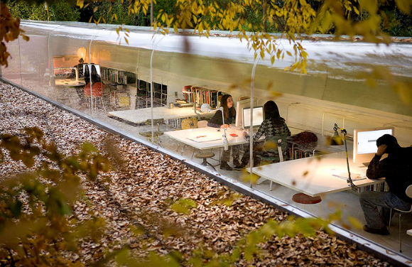
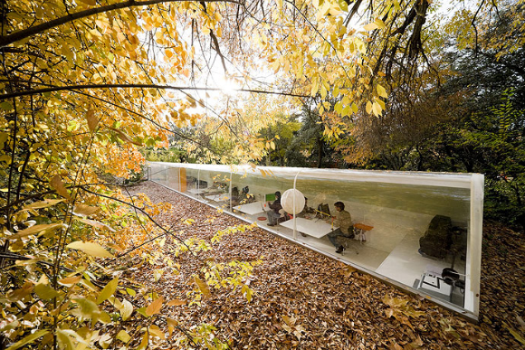
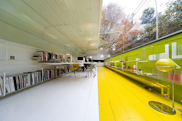
The innovative workspace of Selgas Cano Architecture in Madrid-Spain,
serves as an inspiration for all who work there. Half of the office space is
underground and the other half has a glass ceiling, bringing nature closer to
the employees. No matter if you´re inside or outside the view is fantastic. Criticism
of course, lies on the facts that it resembles a test-tube, where no apparent
ventilation can be seen, or privacy (for work purposes) can be achieved. On the
other hand who’s to say that working in a congested cubical, in an office
building with artificial light and ventilation is actually better, or
productivity enhancing ?
The unusual office building
was designed by the architects themselves and build in the beautiful forest
area nearby Madrid
the experimental Clarity bike
Labels:
2Wheelers
Experimenting on the
materials side of how bicycle frames are engineered and consecutively produced, Designaffairs Studio in
Munich, Germany, a multidisciplinary design studio, examined many high-tech
plastics, acrylics and polymers, before setting on Trivex used primarily for
optics lens and on eyewear (especially those of kids), as a better alternative
to Polycarbonate due to its high impact resistance.
The polymer allows for
injection moulding, which should facilitate affordable and precise mass
production while enabling unique form factors and a multitude of possible
colour combinations. Initially the polymer was used in military applications. Even
though the compound has a lower density than polycarbonate & acrylic, it’s
advanced performance includes exceptional impact resistance and ultra-light
weight. It also offers outstanding chemical resistance and thermal stability as
it is virtually unaffected by most organic and inorganic chemicals and
withstands very hot and cold temperatures. See the studio’s info and photos here.
25 February, 2013
Les Bains Des Docks
Labels:
Architecture
Les Bains Des Docks (The Bath
by The Docks) is an Aquatic Center in the city of Le Havre ,
France Le Havre
The overall design was
inspired by the Roman thermal baths as people can go to congregate in most of
the various pools year round. The simple exterior of the building is a precast
concrete painted black with a grey base and random windows of varying sizes.
Inside there are of over 6 indoor and outdoor pools in different areas
including an Olympic sized lap pool and children's play area. Most of the
interior consists of straight, boxy designs painted in white with the exception
of a children's play area which is multicolored. Several of the indoor pools
are at varying levels and waterfalls give a natural division to the different
spaces. Large skylights and exterior windows bring in natural light throughout.
For more information on the project you can go here.
The photographs of Oil by Edward Burtynsky
Labels:
Photography
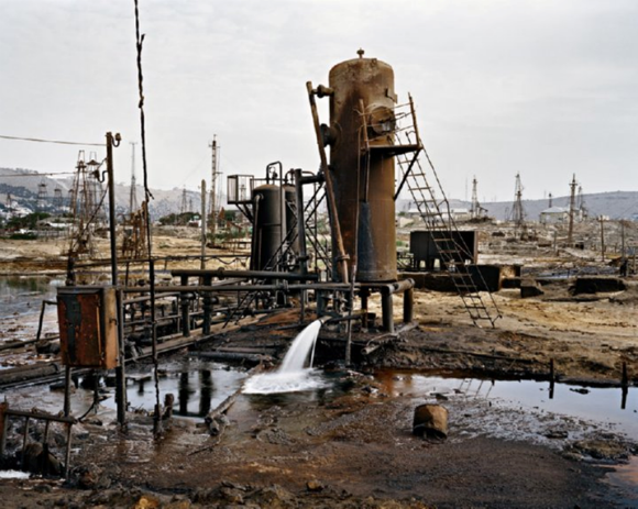
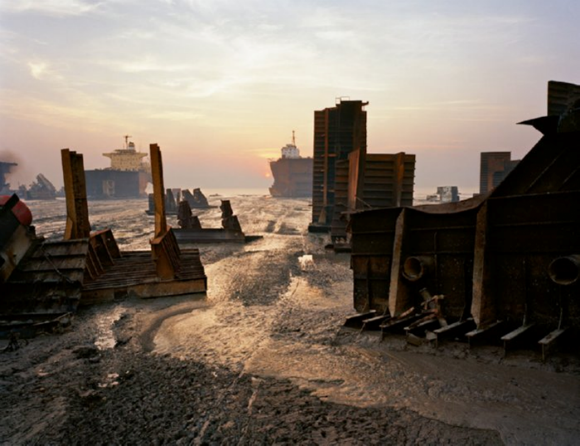
Edward Burtynsky has spent 15 years photographing oil ;
from the fields where it is sourced, to the cars it powers, to the detritus it
leaves behind. His photographs poetic and stunning, portray a reality few of us
know, and unfortunately in this case, fewer of us realise. Shocking the altered
landscapes as may seem, they are unavoidably recognised as the doing of man ;
nature was rarely involved.
Oil Field, Bakersfield , California
Oil Field, Socar , Azerbaijan
In Byrtynski’s words :
“Nature transformed through
industry is a predominant theme in my work. I set course to intersect with a
contemporary view of the great ages of man; from stone, to minerals, oil,
transportation, silicon, and so on. To make these ideas visible I search for
subjects that are rich in detail and scale yet open in their meaning. Recycling
yards, mine tailings, quarries and refineries are all places that are outside
of our normal experience, yet we partake of their output on a daily basis.”
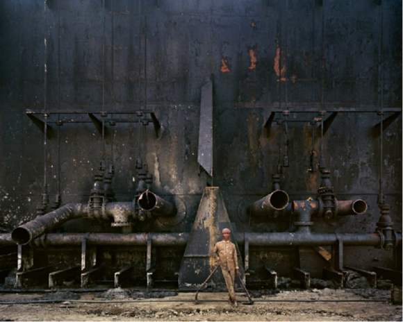
Dismantling
the Tankers, Bangladesh
Dismantling
the Tankers, Bangladesh
“These images are meant as
metaphors to the dilemma of our modern existence; they search for a dialogue
between attraction and repulsion, seduction and fear. We are drawn by desire -
a chance at good living, yet we are consciously or unconsciously aware that the
world is suffering for our success. Our dependence on nature to provide the
materials for our consumption and our concern for the health of our planet sets
us into an uneasy contradiction. For me, these images function as reflecting
pools of our times.”
BP Oil
Spill, gulf of Mexico, April 2010
Burtynsky, photographs the
calamity for nature, caused by man. He visits mines and quarries, goes where
production is heavy in Australia
and China
Exploration into music with Hitlantis
Labels:
Muzik
Hitlantis, from Finland
In order to be able to use Hitlantis,
you must register as either User or as an Artist. Registration and profile
creation is free, and the registering process is simple as it asks you to fill
in your basic user info like name, email address, country of residence and
password of your choice. Then you are ready to begin editing your profile by
uploading pictures and music (Artists only are allowed to upload music files).
After registration, an Artist
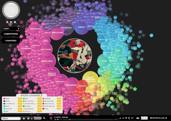
profile will automatically appear on the Hitlantis Map as an icon shaped as a
ball, colour representing the musical genre chosen by the Artist. The beginners
always land onto the outer skirts of the map. Artists get hotness points and
move towards to the Center when a song is listened, or when someone listening a
song clicks "Thumbs up"- button on the bottom bar, when someone
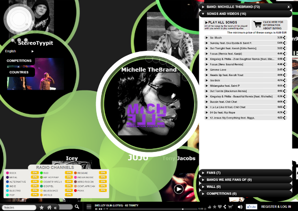
becomes a fan of the Artist, or finally when a song is bought. Every official
fan of a band will be visualised inside the band ball as a smaller Fan Ball (in
the zoomed view). Mouse over these Fan Balls will pop up a label indicating the
current fan’s name and activity points. The fans are also listed in the artist
profile card.
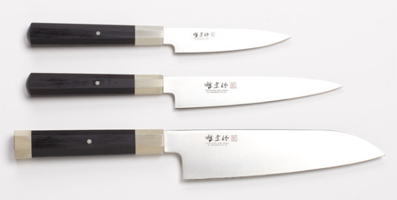
Masanobu knives
Labels:
Tools
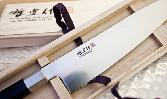
An embodiment of the best
elements of traditional and Western-style Japanese knives, the Masanobu VG-10 Series seamlessly
pairs modern technology with traditional hand crafted techniques. Using VG-10
steel for the blade, Masanobu has created a knife that has a razor sharp edge
that is also stain and corrosion resistant. VG-10 Cobalt, a strong steel forged
of iron, carbon, manganese, molybdenium, colbaltium, chromium and vanadium ; one
of the highest quality types of steel used in knife production, retains an
excellent level of sharpness that is easy to maintain.
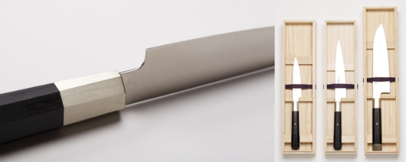
The thinness of the blade and
the octagonal shape of the handle are design points found in the highest
quality traditional Japanese knives, allowing for precision cutting and a
secure grip. It is without a doubt that the Masanobu VG-10 Series is amongst
the elite line of knives available. The series is comprised by five blades
characterised per their use as : a chef’s knife, a slicer an utility (petty)
knife, a multi-purpose and a French slicer.
Features a traditional,
octagonal, pressed wood handle with nickel silver bolsters for perfect balance.
Manufactured by Mcusta, in
the city of Seki, home to Japan's most skilled knife makers since the 13th
century, the corrosion and stain resistant VG-10 steel is as thin and strong as
can be. The Santoku, which means "three virtues," is capable of
handling fish, vegetables and meat, while the other two, smaller knives are
best suited for more intricate tasks.
22 February, 2013
Halley VI Antarctic Research Station
Labels:
Sci^Tek
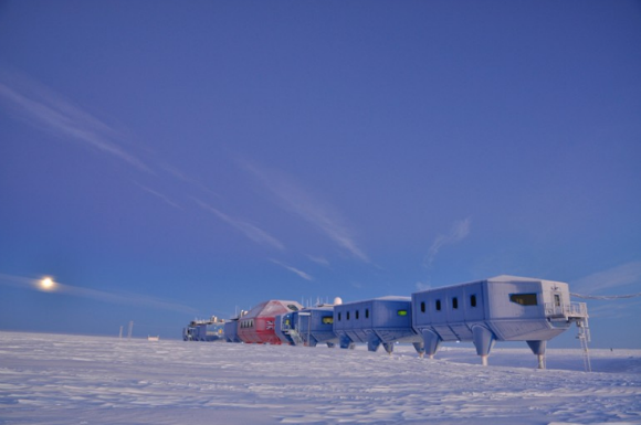
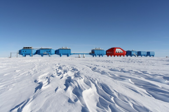
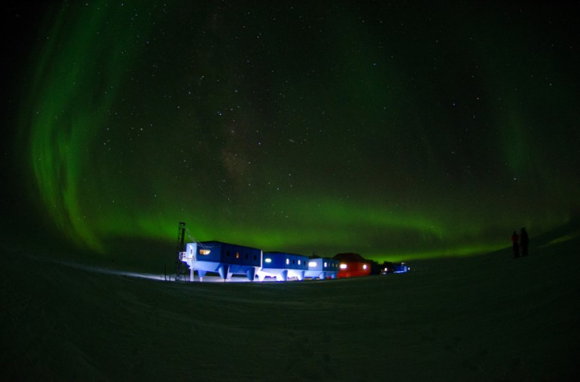
Halley VI Research Station is
the first fully re-locatable research station in the world. It was commissioned
in 2006 and its unique and innovative structure was the result of an
international design competition in collaboration with the Royal Institute of
British Architects (RIBA). The station took four years to build and delivered
its first scientific data in 2012. Its iconic design houses a cutting-edge
science platform and modern, comfortable accommodation.
The British Antarctic Survey’s Halley VI
Antarctic Research Station is online just 900 miles from the South Pole. Halley VI is the most
southerly research station operated by the British Antarctic Survey and is
located 10,000 miles from the UK
However, the Halley VI has
been uniquely engineered to overcome Antarctica ’s
inhospitable climate. Based off the award-winning design by Hugh
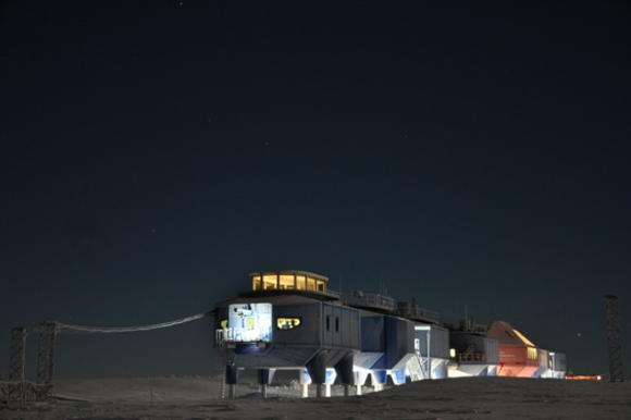
Broughton Architects, the station features modular compartments,
hydraulically raised supports, and attachable ski pontoons. The hydraulically
elevated ski based modules respond to annually rising snow levels and the need
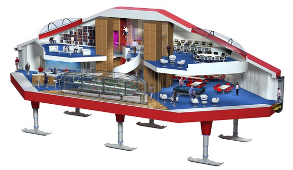
to relocate the base if the site calves off as an iceberg. A special central
module provides a dramatic open plan social area at the heart of the station.
Unlike other fixed research facilities, Hally VI can be reconfigured as needed,
raised or lowered depending on snow conditions, and moved piece by piece when
its section of ice drifts too close to the sea.
While being more expensive to
built initially, the Halley VI will have a drastically increased lifetime,
making it a worthwhile investment in the long run. Read more info on the design
work for the units here.
View more pictures here.
The central red module
contains the communal areas for dining, relaxation etc., while the blue modules
provide accommodation, laboratories, offices, generators, an observation
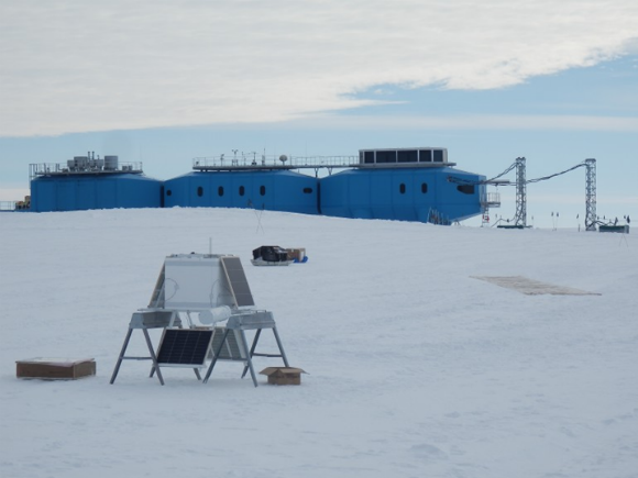
platform and many other facilities. Remote scientific equipment, set up for
long-term monitoring, is housed in a number of cabooses around the perimeter of
the site, which also contains numerous aerials and arrays for studying
atmospheric conditions and space weather. The station operates throughout the
year with a maximum population of 70 in the summer and an average of 16 over
winter. The Emperor penguin colony near Halley, which is present from May to
February, is a special attraction, while other recreational trips take members
further inland towards the "hinge zone" where the floating ice shelf
is joined to the continent. Read more on the station here.
The purist’s bikes from Schindelhauer
Labels:
2Wheelers
Schindelhauer is a German
company that produces timeless, minimalist, elegant bicycles. The company
states "Our bikes offer a number of outstanding properties: freedom from
maintenance, durability and reliability". Their collection features six
models, with the fixed gear/single speed Viktor and Siegfried being unique in
form, appearance and simplicity of use. True urban bikes, for stylish daily
rides to the office.
Taken from their website : “Schindelhauer
Bikes represent urban sportsmanship and timeless elegance you can fully trust
in. In accordance with the motto “Pure pleasure riding a bicycle” our bikes are
designed and made for tough everyday use. Furthermore, they are unique by means
of bike technology. Above all they embody that purist style which enables them
to be far more than simple means of transportation. Waiver of all superfluous
details give Schindelhauer Bikes their unique and original character which is
displayed to the last detail throughout the range of models. Due to the
long-lasting Gates Carbon Drive™ belt used, all Schindelhauer Bikes offer a
number of outstanding properties: freedom from maintenance, durability and
reliability. For this reason the drive heralds a new age throughout the urban
cycling world. It is the icing on the cake on the timeless and minimalist
Schindelhauer Bikes”.
Socializing with TipTap. Something new ?
Labels:
SocioX
TipTap,
based in Cambridge , Massachusetts
According to its founders :
“TipTap is the first personality-driven social discovery site, allowing you to
discover new things from people who share your personality, tastes and style.
Indulge in our quizzes to uncover aspects of yourself and connect with people
who are just like you. Then, discover and share the things that you love with
your own community of like-minded people”. Read through their “personalities”
list here.
There are three types of
personality quizzes: Personality, Tastes, and Style. Each quiz takes only a few
minutes, and are fun little activities to participate in. By taking a few short
personality quizzes, the website will recommend followers with comparable
tastes and personalities. For each follower it provides a percentage of
compatibility, making it easier to decide whether you want to follow others or
not. Once you’ve followed other members, you’ll be able to participate in taps.
Taps are how you share images, videos, or music. This functionality is
comparable to Pinterest, as it creates a stream of taps. Your tap stream is a
combination of shares from yourself and your followers. With any tap you share,
you’re able to add comments and tags, and these tags will be searchable in
future enhancements.
Perhaps more important is the
fact that TipTap can deliver comprehensive, intuitive, and uniquely predictive
understanding of users without violating personal privacy, because this
predictive power results from novel data that is sufficiently abstract and
impersonal, as opposed to tracking user behavior. TipTap's psychological
approach - directly tapping users' personalities, styles and tastes - allows
for more meaningful discovery of immediately relevant information by extending
trust and relevance to a broader group of users with similar tastes and preferences.
After using it you’ll grown to really appreciate the personality matches.
Recommended for users who love new social networking sites. It’s also a great
social tool for bloggers, great for anyone looking for new site traffic.
21 February, 2013
Design hotels [.com]
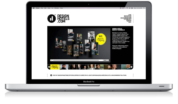
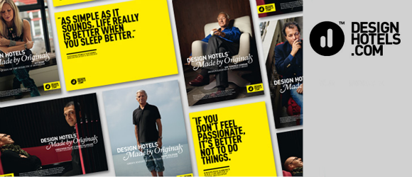
Design Hotels represents and markets a
curated selection of more than 200 independent hotels in over 40 countries
across the globe. More than a collection of hotels, the company is a collection
of stories. Each location reflects the ideas of a visionary hotelier, an
"Original," someone with a passion for genuine hospitality and
cultural authenticity, for thought-provoking design and groundbreaking architecture.
All "Originals" stand for the individual, aesthetic and
service-driven experiences that their hotels provide. See a collection of
videos from locations around the globe here. See the actual hoteliers
showcasing their hotel, and their city here.
Founded by Claus Sendlinger
in 1993, Design Hotels has developed into a full-service hospitality marketing
consultant, offering customized services including global sales representation,
revenue management, strategic marketing, public relations and branding. The
company has its headquarters in Berlin and
branches in London , Barcelona ,
New York , Singapore
and Perth
Furniture, objects, clothes, design
in general has always been around us. But it is only in recent years that the
concept of “design” has become essential to the hotel industry. It was Claus
Sendlinger, Founder and CEO of Design Hotels, who foresaw this development 20
years ago. He predicted that “design will become an integral part of hotels”
and “design-driven hotels will become a lifestyle choice for future travelers.”
This was the seed from which the company started growing in 1993 bringing
together the world’s most innovative, outstanding and progressive hotel
concepts under one umbrella brand, and offering these to a like-minded crowd.
See a video of Claus explaining the concept’s main points here
Nowadays most hotels feature
an element of contemporary design. “Design hotels” have become a hotel segment.
So, what makes the brand special ? Each hotel was visualised and implemented to
offer far more than a designer chair in the lobby; every hotel in the Design
Hotel collection provides a specific experience. Architecture, design, service,
gastronomy and other special qualities such as the perfect location come together
like interlocking pieces of a puzzle to form a consistent and coherent concept.
Every single member provides an individual, aesthetic and service-driven hotel
experience and reflects the vision of an independent hotelier - an
"Original" with a passion for cultural authenticity and genuine
hospitality that is rooted and enhanced by thought-provoking design and
architecture. Each of the member hotels was “Made by Originals”!.
NewsMap
Labels:
Publications
Newsmap is an application that visually reflects
the constantly changing landscape of the Google News news aggregator. A treemap
visualization algorithm helps display the enormous amount of information
gathered by the aggregator. Treemaps are traditionally space-constrained
visualizations of information. Newsmap's objective takes that goal a step
further and provides a tool to divide information into quickly recognizable
bands which, when presented together, reveal underlying patterns in news
reporting across cultures and within news segments in constant change around
the globe. [1]
Google
News automatically groups news stories with similar content and places them
based on algorithmic results into clusters. In Newsmap, the size of each cell
is determined by the amount of related articles that exist inside each news
cluster that the Google News Aggregator presents. In that way users can quickly
identify which news stories have been given the most coverage, viewing the map
by region, topic or time. Through that process it still accentuates the
importance of a given article.
NewsMap
was created by Marcos Weskamp, a Design Engineer who has a deep interest in
playing with and visualizing lots of data. He is a self-taught technologist
who, as he says, constantly investigates the fields of Interaction Design and
Information Visualization. You can also access NewsMap from our sidebar
NewsRoom section here at Metronome.
20 February, 2013
POP-UP Office from Dubbeldam Architecture+Design
Labels:
WorkSpaces
Dubbeldam
Architecture+Design is a Toronto based multi-disciplinary design studio
recognized for creating innovative and environmentally responsible design
solutions that are timeless and uniquely designed for each client and context.
The studio’s design process is characterized by teamwork and intensive
collaborative exchange, resulting in projects that reveal a conceptual clarity
and are crafted with a meticulous attention to detail. Completed and current
projects range from the design of single and multi- family housing, to
commercial and institutional renovations, and includes landscape, furniture and
installation design.
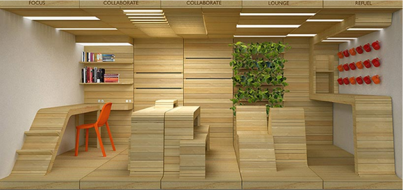
POP-UP Office installation is
a concept space which attempts to answer the question “how do you work?”
displayed as part of Toronto
Built out of reclaimed wood
pallet boards and their frames, separate modules collectively form the modern
work place facilitating both individual work and collaboration – a workspace,
collaborative space, lounge area and refueling station. In sinuous forms, the
reclaimed boards morph from the wall and floor into furniture elements, sanded
where the human body comes in contact with the wood and left rough where it
does not. The modules are comprised of separate planes (floor, wall, ceiling)
and furniture elements that are assembled in different configurations. Modular
shelves can be inserted into slots between wall boards, creating adjustable
display and storage areas. Smaller ledges slide into gaps between the wood
slats. [2]
Superbude St Pauli super hostel in Hamburg
Labels:
ESCape
Superbude (bude stands for
“digs” in German), delivers a concept in affordable travel accommodation full
of local sprite. The Superbude
St.Pauli hotel/hostel is located in a neighbourhood of Hamburg
Dreimeta were responsible for also
designing this second Superbude hotel/hostel after the
success of the first. The St Pauli location follows their other St Georg
location, and shares its distinctive eclectic design. The characteristic rope
pattern motiff is viewable everywhere, printed in the carpet and laser burnt on
the wooden panels. The alternation of actual rope hanging (pointing towards Hamburg as a port city), and the wall decors serve to
reconnect Hamburg
Subscribe to:
Posts (Atom)










+logo-w200.png)

